Branding 101 Guide: How to Build a Brand That Feels Aligned, Intentional, and Recognizable
- Apr 11
- 3 min read
Branding is often misunderstood.
It’s reduced to logos, color palettes, and fonts - treated as a visual exercise rather than a strategic one. But the truth is, branding is not about how your business looks. It’s about how it feels.
It’s the impression you leave. The consistency you create. The clarity you communicate without having to explain yourself.
Before you choose a single design element, you need to understand this: strong branding is built from the inside out.
Start With Feeling, Not Aesthetic
Most people begin branding by asking, “What do I want it to look like?”
A better question is: What do I want people to feel when they experience my brand?
This is your foundation. Without it, every decision that follows - fonts, colors, visuals - will feel disconnected.
A brand can feel refined or expressive. Minimal or bold. Soft or structured. Approachable or elevated. The key is choosing your direction intentionally, not accidentally.
When you define your brand’s energy first, you create a filter. Every visual and messaging decision becomes easier because it either aligns - or it doesn’t.

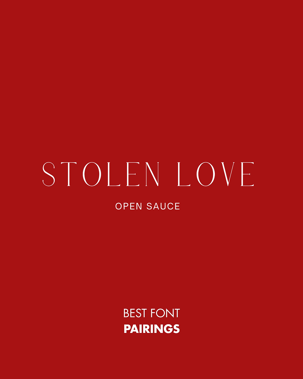
Typography: The Voice of Your Brand
Fonts are more than design - they’re communication.
The typography you choose immediately signals who you are and how you show up. A serif font, for example, often carries a sense of tradition and refinement. It feels editorial, timeless, and elevated. A sans serif font leans more modern - clean, structured, and clear. Script fonts, when used intentionally, can feel personal and expressive, but require restraint to avoid feeling overwhelming.
The goal isn’t to use everything - it’s to use the right combination.
Most strong brands rely on just two fonts: one for headlines and one for body text.
Occasionally, a third is introduced as an accent. Beyond that, it becomes noise.
Consistency in typography creates recognition. And recognition builds trust.


Color: Emotional Positioning, Not Decoration
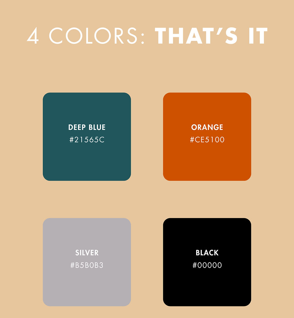
Color is one of the most powerful tools in branding - but it’s also one of the most overused.
A strong color palette doesn’t need to be extensive. In fact, the more restrained it is, the more impactful it becomes.
A well-balanced palette typically includes a few core colors supported by neutrals, with one intentional accent. This creates hierarchy. It allows certain elements to stand out while others provide structure.
More importantly, your colors should reflect your brand’s positioning. Neutral palettes often communicate sophistication and calm. High-contrast combinations can feel bold and modern.
Softer tones tend to create a sense of ease and approachability.
The goal isn’t to choose colors you like. It’s to choose colors that support how you want to be perceived.
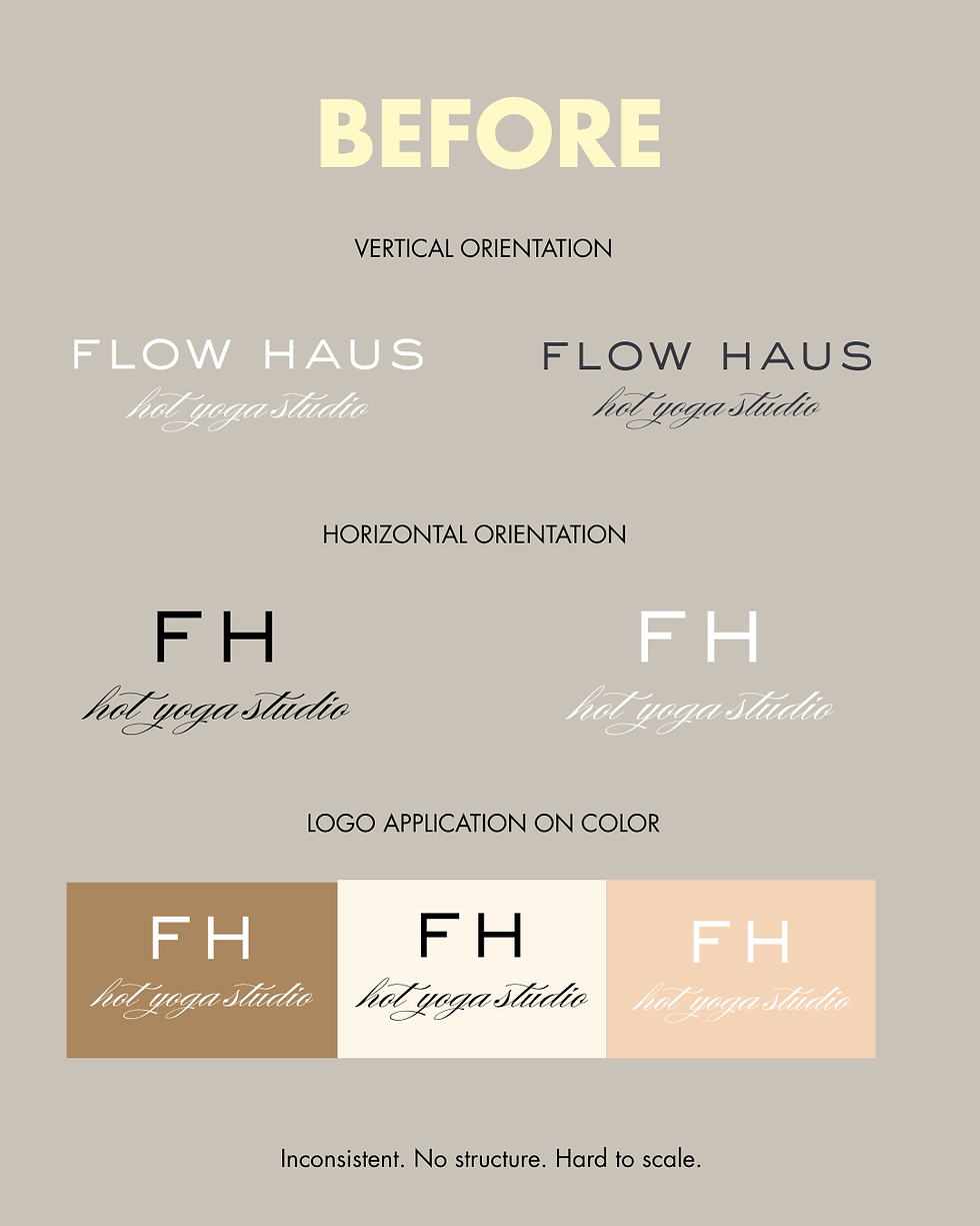
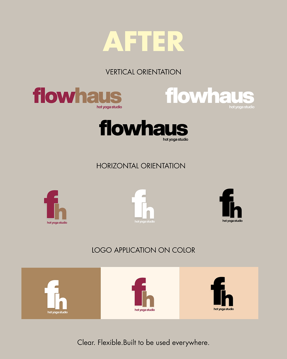
Your Logo Is a Starting Point - Not the System
There’s a common misconception that once you have a logo, your branding is complete.
In reality, your logo is just one piece of a much larger system.
A well-developed brand includes variations - different versions of your logo that work across platforms and contexts. What works on a website header may not translate to social media, email, or print.
More importantly, your brand should not rely on your logo to be recognizable. It should be supported by your typography, colors, layout, and overall visual language.
When everything works together, your brand becomes cohesive. When it doesn’t, it feels fragmented.
Consistency Is What Creates Credibility
You can have a beautiful brand and still feel misaligned.
This usually comes down to inconsistency.
If your website feels elevated but your social content feels scattered, or your emails don’t match your visual identity, the experience becomes disjointed. And when something feels off, people hesitate.
Strong brands remove that friction. They create a seamless experience across every touchpoint - visuals, messaging, tone, and structure.
Consistency is what makes your brand feel established, even in the early stages.
The Real Goal: Recognition Without Explanation
The most effective brands don’t need to introduce themselves.
They’re recognizable in an instant.
This doesn’t come from one design choice - it comes from repetition, alignment, and intention over time. When your brand is clear and consistent, people begin to associate certain visuals, tones, and feelings with you.
That’s when your brand starts working for you.
Final Thoughts
Branding is not about making things look good. It’s about making things make sense.
It’s the structure behind your marketing. The clarity behind your messaging. The consistency that builds trust before a single conversation happens.
When done well, branding becomes more than visual - it becomes a strategic advantage.
So before you choose your colors or finalize your fonts, take a step back.
Define how you want to be experienced.
Everything else will follow.


Comments